Belmont
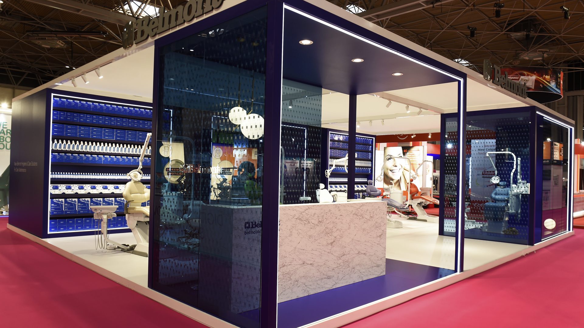
Simplicity is often the best and most elegant approach to an exhibition stand design.
Glass is a beautiful material so it was good to be able to use it to stunning effect on this stand. Shot blasted with a stylized chair image and tinted blue the effect was unusual for an exhibition stand and certainly caught the eye. Following the success of the stand at the 2018 Dentistry exhibition Belmont decided to re-use the stand but make some modifications. To make this possible a slightly increased stand space was purchased. Because of this it was possible to add flooring and use neon light strip. It would be good to create a new stand for 2020 but it seems that the stand will be used for a third year. Consideration will be given to some subtle changes so that we can continue the less is more theme which does seem to have impressed both visitors and other exhibitors.
We were particularly pleased when approached by one exhibitor who has asked us to quote for a stand to be built in 2020.
More Case Studies


